Creating better user experience for account registrations and addresses
In order to enhance customer engagement and streamline the user experience, Bike24 embarked on a major initiative to refine its data service and sign-up process. By focusing on recognizing and separating B2B and B2C customers, we aimed to deliver more tailored experiences, while simplifying the sign-up journey to encourage faster and more efficient account creation. This case study explores how these improvements led to more personalized customer interactions, increased conversion rates, and ultimately, a more seamless onboarding process for new users.
My Role: Product Designer | Team: Checkout & Retain | Duration: 6 months | Collaboration with Peter (Product Manager), Engineers, Legal

We discovered that we ask for too much information too early!
We identified several critical pain points across forms on key pages, which created friction in the user journey:
Sign-Up Forms: Overly complex with unnecessary fields, leading to user drop-off during account creation.
Address Selection in Checkout: Lacked intuitive design and error prevention, causing inaccuracies and delays during the checkout process.
My Delivery Address Section: Absence of robust validations resulted in errors, requiring manual corrections and affecting user confidence.
These issues disrupted the user experience and increased the likelihood of incomplete processes, ultimately impacting conversions and customer satisfaction.
We conducted an in-depth analysis of our data to improve the form experience:
Google Analytics error-tracking data revealed the frequency and location of errors triggered in forms, helping us identify which input fields required iteration.
Microsoft Clarity recordings and heat maps provided insights into how customers interacted with our existing forms.
Customer service data showed approximately 600 support requests related to account creation in the first quarter of 2023, highlighting key pain points.
This comprehensive analysis guided our approach to optimizing the account creation process.
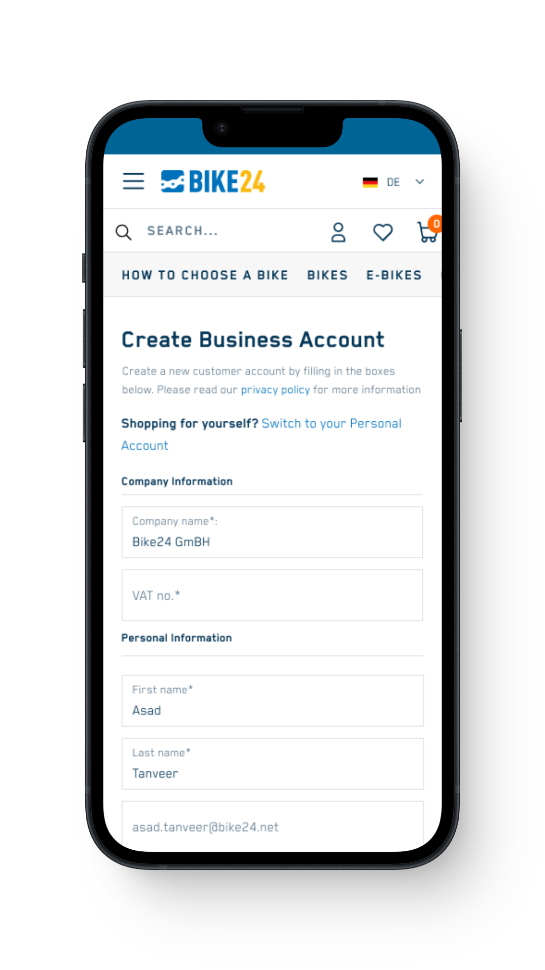
Identifying differences between Customers and B2B accounts.
Business Account:
VAT Number
Company Name
First Name and Last name
Email and password
Personal/Customer account:
First Name and Last name
Email and password
Creating account takes too much time and effort..
As a customer, I dont like filling up long forms and entering irrelavant data at this point. Why am i instructed with long text and asked too many questions already?
1. Unnecessary Information and Distracting User Interface
The initial user interaction was hindered by unnecessary information and a distracting user interface. This led to users being overwhelmed and guided toward UI elements that were irrelevant to their immediate needs. The first impression of the customer, shaped by this cluttered interface, created friction right from the start, which could discourage users from completing the sign-up process and moving forward with their engagement.
2. Unnecessary Salutation Field
The salutation field was an unnecessary step in the sign-up process, especially considering our goal to separate business and customer accounts. Since the salutation did not contribute to the user’s experience or the segmentation of accounts, it was deemed redundant.
3. Early Checkout Requirements and Unnecessary Fields
When a customer creates an account, they might not be ready to complete a purchase immediately. Requiring them to enter additional details, such as addresses, at the early stages of the sign-up process could create unnecessary barriers. This step can overwhelm users and increase the likelihood of drop-off.
4. Lengthy Legal Text
The legal text presented during the sign-up process was excessively long and complex. This caused unnecessary friction, as most customers are unlikely to read through lengthy terms and conditions while signing up. The presence of this overwhelming text at the beginning of the user journey risked scaring off potential customers and creating a barrier to completing the sign-up process.
Quick Brainstorming session with Product Manager
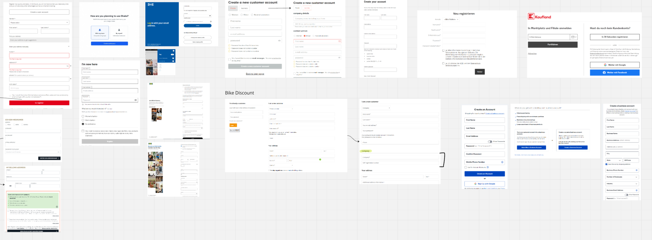
References and inspirations
Create account creating experience a delight for our customers..
Onboard customers quickly by asking for less information and creating a seamless user experience with infield validation and better error display.
1. Text Reduction and Account Switch
Collaborated with the legal team to significantly reduce the introduction text, ensuring only necessary information is displayed to users.
Simplified the initial user experience by providing minimum required details while maintaining compliance.
Introduced a seamless option to switch between business and personal accounts, allowing users greater flexibility based on their needs.
Conducted a spike during the sprint to evaluate the necessity of the salutation field for order processing.
Result: Salutation field removed, as it was not essential.
Shifted address input to the checkout phase, allowing users to skip unnecessary steps during sign-up.
Focused on reducing form fields to only the most necessary information.
Enabled browser auto-fill functionality, allowing users to complete sign-up in just a few seconds.
3. Legal Text for Opt-In
Consulted the legal team to evaluate and streamline the text displayed for newsletter subscriptions and personalized advertising opt-ins.
Result: Significantly reduced the length of the legal text while maintaining compliance with regulatory requirements.
Form fields on the platform are now more intuitive, better error handling and overall better experience.
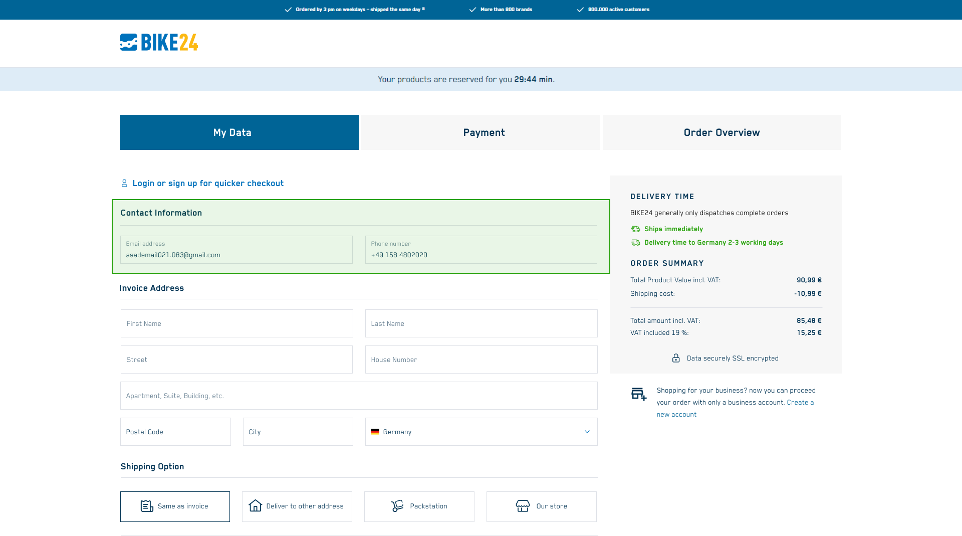
Streamlined the checkout process by reducing text fields, creating a seamless and efficient experience. Redesigned the login/sign-up link to minimize distractions, ensuring a more focused and user-friendly journey for customers.
Redesigned error messages to prevent overlap with input fields, reducing user frustration and improving clarity. Simplified and reduced input fields to enhance usability and streamline the customer experience.
Implemented a prompt encouraging customers to switch to a B2B account if they frequently order for business purposes. This initiative successfully migrated business customers and accurately assigned them to the appropriate accounts, improving account management and user experience
We also failed at some point..
After implementing a new design during checkout, we observed an increase in errors related to the email and phone number fields, as tracked through error events.
In August, 3.3k errors were reported following front-end changes to the address selection page. Using Microsoft Clarity, I analyzed user behavior and identified a key issue: customers were mistakenly leaving the first field empty which triggered the error.
This insight allowed us to pinpoint and address the root cause, improving the checkout experience and reducing user frustration.
Quick solution: Let’s revert back..
We swiftly reverted to the previous design, placing the email field under the contact section. This adjustment provided greater clarity for users, allowing them to quickly adapt and significantly reducing the errors encountered during checkout.
Resulting in improved checkout time to complete and reduced errors.
Outcome
Reduced errors in sign-up and address fields by 58%, improving overall user accuracy and satisfaction.
Decreased sign-up page bounce rate by 5.3%, retaining more users in the conversion funnel.
Increased account registrations by 33% (+700), driving significant user growth.
Successfully differentiated B2B and B2C accounts to meet SAP requirements and enhance account management.
Significantly decreased sign-up time by optimizing the process.
Simplified the form by removing unnecessary information and reducing legal text, enabling users to complete sign-up more quickly and efficiently.
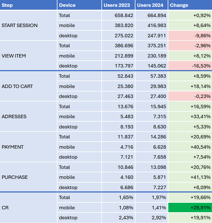
Blackfriday 2023 vs 2024
Way forward (Track & Iterate)
We are always tracking errors and input validations to keep iterating for our customers.
Improving end-to-end checkout process which will further reduce time to checkout for a user.
Signing up with social accounts, this long due initiative will bring more registered customers.


