Thinkimmo.com is a platform for property investors in Germany. The platform is designed to help investors find a lucrative deal by giving them top-edge data points to make a decision. The platform offers a diverse range of filters to curate a search that would result in focused results.
Role: Product Designer
Year: 2022
Outcomes:
Increased subscription rate by 10%
NPS score increased
Less customer service is requested resulting in a time cost saving of the customer service team.
Decreased churn rate as a result of customers finding the right property with the right filters.
Increased conversion rate from Trial user to paid user by 5%
Introducing User-Centric Delight:
Making finding the right property for the right investment easier
Problem Statement
The current user experience of the real estate investment platform lacks empathy and fails to address the needs of real estate investors. Through extensive conversations with users and thorough research of the real estate market and investor behavior, it has become evident that a major problem exists for investors seeking good investment opportunities.
Problem: The real estate investor requires a more effective and user-friendly platform to identify and track potential investment properties based on specific criteria and preferences.
Solution: The platform needs to offer search alerts and advanced filtering options that cater to the unique needs and preferences of real estate investors, enabling them to identify and evaluate investment opportunities accurately and efficiently.
By addressing this problem and providing a solution, the platform can greatly enhance the user experience and empower real estate investors to make informed investment decisions.
Discovery Phase
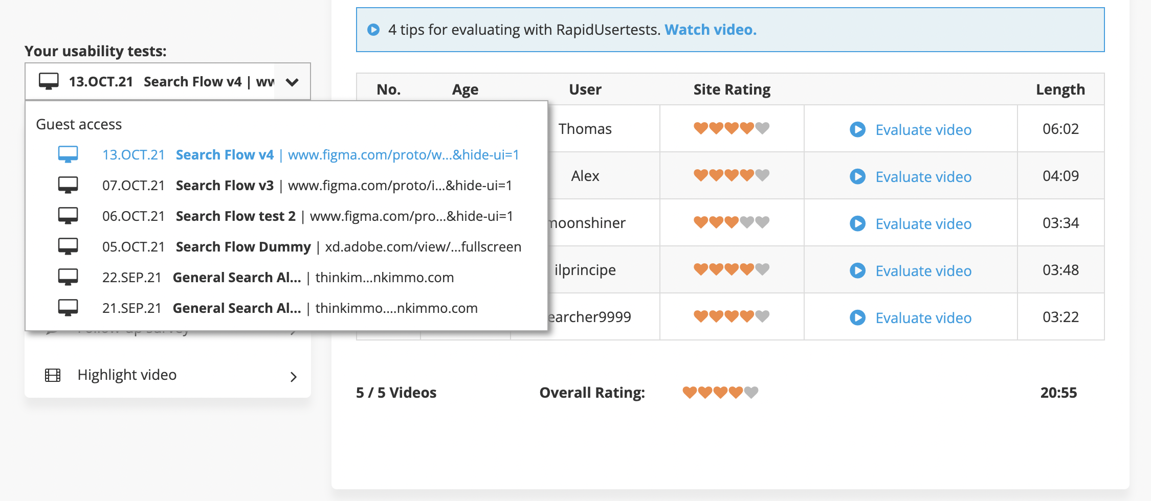
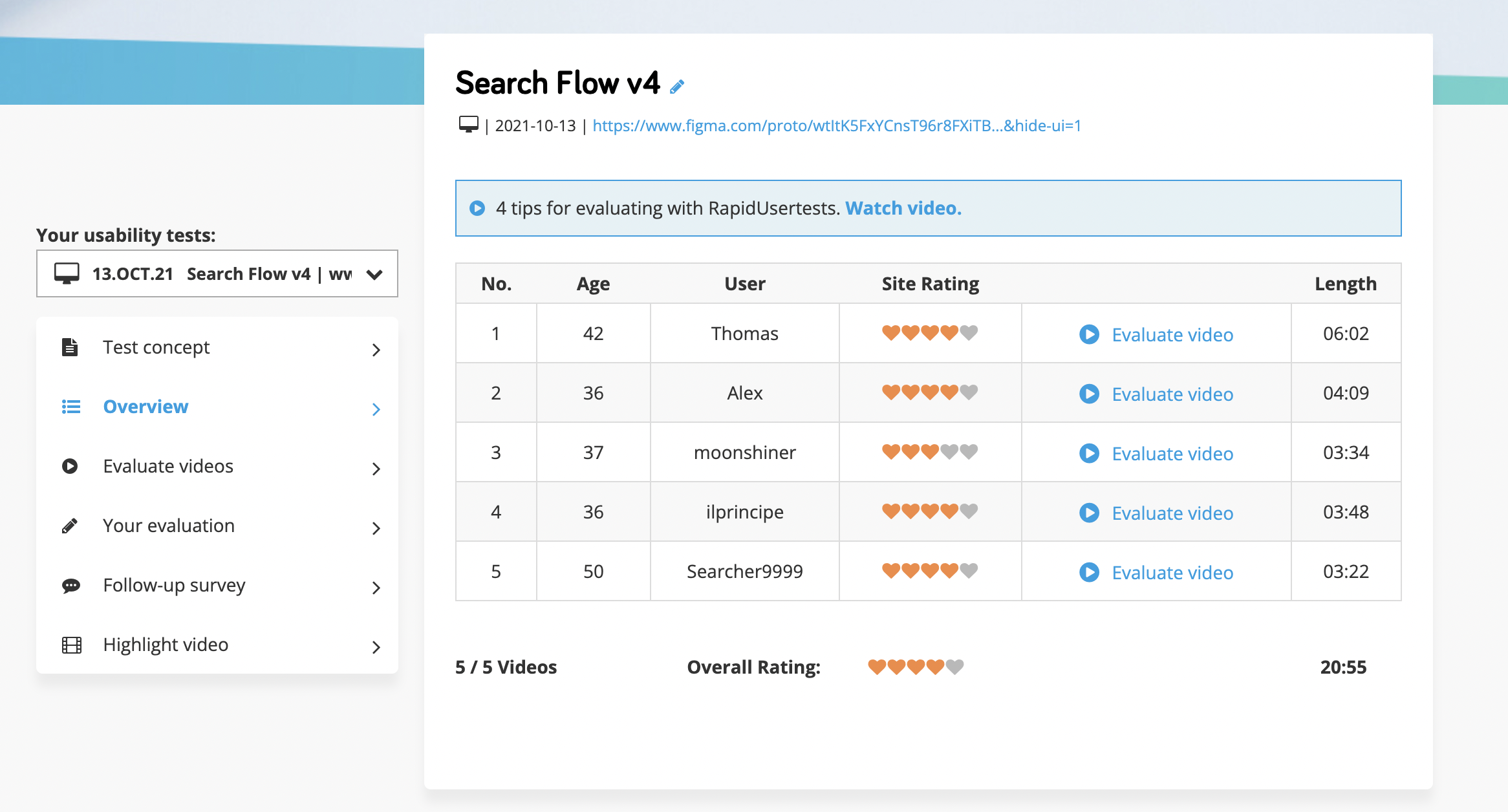
The challenge to identify the user pain points through the customer journey of Thinkimmo from signing up to creating a search alert and refining the results was first to try something that the founders did not do. The first thing was to conduct usability testing to find user problems with the new users and to get data from Customer service to quantify and prioritize the user problems that need to be identified first.
As technology rapidly evolves, ensuring a seamless user experience is crucial for any online platform. ThinkImmo, a platform for real estate investors, recently embarked on a journey to optimize user satisfaction. By leveraging the Rapidusertesting platform and analyzing data from customer service interactions, ThinkImmo sought to identify and address common user problems. The focus was primarily on new users, aiming to observe their interactions with the search alert creation process and filter usage.
Usability Testing: A Holistic Approach
Usability testing is an invaluable tool for identifying pain points and improving user experience. By employing the Rapidusertesting platform, we gained valuable insights into how new users interacted with ThinkImmo. This allowed us to evaluate their mindset, preferences, and expectations regarding search alerts and filter usage.
Identifying User Problems
The data derived from customer service interactions became a cornerstone in our quest to discover recurring user problems. By thoroughly analyzing these interactions, we were able to identify recurring patterns and gain a deeper understanding of the challenges that new users faced. By pinpointing specific pain points, we could prioritize and address them effectively.
Creating Search Alerts: Enhancing User Engagement
One significant aspect of optimizing the user experience was focusing on search alert creation. To facilitate this process for new users, we made several key adjustments. First, we simplified the interface, ensuring that the necessary fields were readily apparent and easily accessible. We also provided clear instructions and tooltips to guide users through the search alert creation process. Additionally, we implemented real-time notifications to keep users informed about new listings and updates, further enhancing their engagement. The filters can now be selected easily and each filter applied would show the number of properties it will show each week so the user can in real-time re-visit their filters to refine the search alert.
Conclusion
Through insightful usability testing and the analysis of customer service data, ThinkImmo was able to identify and address user problems effectively. By focusing on new users, we crafted solutions tailored to their needs, improving their experience when creating search alerts and using filters. Our holistic approach ensures that ThinkImmo continues to evolve as a user-centric platform and remains at the forefront of the real estate industry.
Before revamp
After Revamp
Redesigned and restructured the side panel to offer users more space for viewing properties (objects) without distractions. Replaced the previously text-heavy sidebar with an icon-based navigation system, complemented by tooltips to display titles, enhancing usability and creating a cleaner, more intuitive interface.
Filters are now interactive, allowing users to create search alerts by selecting various data points and customizing their search criteria. As users apply filters, the number of available properties updates in real time, providing immediate feedback and helping customers set clear expectations for their search results
Conceptualized and redesigned the expose card of objects to save time for real estate investors, enabling quicker decision-making by displaying highly consumed data directly on the product tile. This approach eliminates the need for users to dig deeper into the description sheet, streamlining the decision-making process.
During the redesign process, we adopted a quick iterative approach to accelerate progress and address key areas needing improvement. Our primary goal was to streamline the user experience and optimize efficiency, using multiple design iterations, user feedback, and ideation to make well-informed decisions for the final user interface.
Key Improvements Implemented:
Consolidation of Filters:
Previously, users had to repeat the same search criteria in multiple locations, resulting in a cumbersome experience.
We restructured the filters into a single sidebar, enabling users to input all their search criteria in one place. This eliminated redundancy and simplified the process of creating search alerts.
Optimized Sidebar Design:
The sidebar was redesigned to occupy minimal space while retaining its functionality.
Essential icons were prioritized, and contextual labels were added as hover-over tooltips to guide users intuitively, improving navigation and reducing confusion.
Redesigned Exposé Card:
The visual presentation of the exposed card was updated to create a more appealing and engaging user interface.
This fresh design enhanced both usability and the overall aesthetic of the platform.
Streamlined Navigation:
Informational pages and customer ID settings were consolidated into a single sub-menu, making them easier to access and more intuitive to navigate.


Quick wireframing on the whiteboard gave us time to quickly iterate to different ideas and how one idea could work. We conducted a full day white boarding session with the whole team to come up with ideas that would impact the user experience and what could be the possible outcomes and constraints.
Add-on: We redesigned the Expose Card
Features and Redesign impact
The redesigning of the expose is one of the most impactful redesigns done at Thinkimmo which allowed users to make quicker decisions. Before the design as seen above, each expose would give you basic information in the same small text and less space for Visuals. After talking to customers and realizing their needs, time, and decision-making abilities. We came up with a solution to add features to the redesigned card.
The new card now allows users to quickly swipe through all the images without clicking and getting to the details page. It also now adds a location precision icon which tells the user how accurate the location(address given by the ad poster) is.
We made decisions to even click the property expose more quickly by adding location and price meters. This enabled users to quickly see if the price and location are fair or not as compared to other properties. This helped people find more suited properties than before, as they previously had to click each property or open a new tab and then compare the properti’s key information which was now all available on the card itself.
Important highlights:
Precision location
Fair price meter
Location Analysis meter
Potential returns
Swipe-able images on expose
Add to favourites or delete ad instantly


